
Elite Pioneer Broker – Case Study
If you’re curious about how UI can shape brand trust, simplify business workflows, and help small brands punch above their weight — this is for you.
Overview
Elite Pioneers is a UAE-based broker consultancy that helps entrepreneurs and investors set up businesses, obtain golden visas, and explore investment opportunities — acting as a trusted link between clients and government entities.
The goal was to design a clean, responsive, and trustworthy website that communicates the company’s value clearly — while also giving users helpful tools *before* they even reach out.
Design Process
Discover
Discover
Stakeholder interviews
Competitor analysis
Stakeholder interviews
Competitor analysis
Define
Define
User needs summary
User needs summary
Ideate
Ideate
Sketching ideas
Sketching ideas
Prototype
Prototype
Wireframes
A/B testing
UI mockups
Wireframes
A/B testing
UI mockups
Test
Test
Feedback sessions
Feedback sessions
1. Stakeholder interviews
To kick things off, I held several interviews with stakeholders to understand their goals, challenges, and expectations. This helped reveal business constraints and areas of friction.
At the same time, I conducted a competitive analysis to explore how similar products approached design and UX. This helped me benchmark the experience and identify gaps and opportunities.
2. Competitor analysis
To understand how others in the UAE mortgage and business finance market communicate trust, we analyzed multiple competitors' websites. Most lacked a clear hierarchy, had cluttered homepages, or didn’t simplify the financial journey — a gap we aimed to solve.
3. User Needs Summary
🤝
Clarity: Users need to quickly understand what services are offered without reading too much.
🌟
Trust: Users want to feel they’re dealing with a reliable, official, and transparent platform from the first scroll.
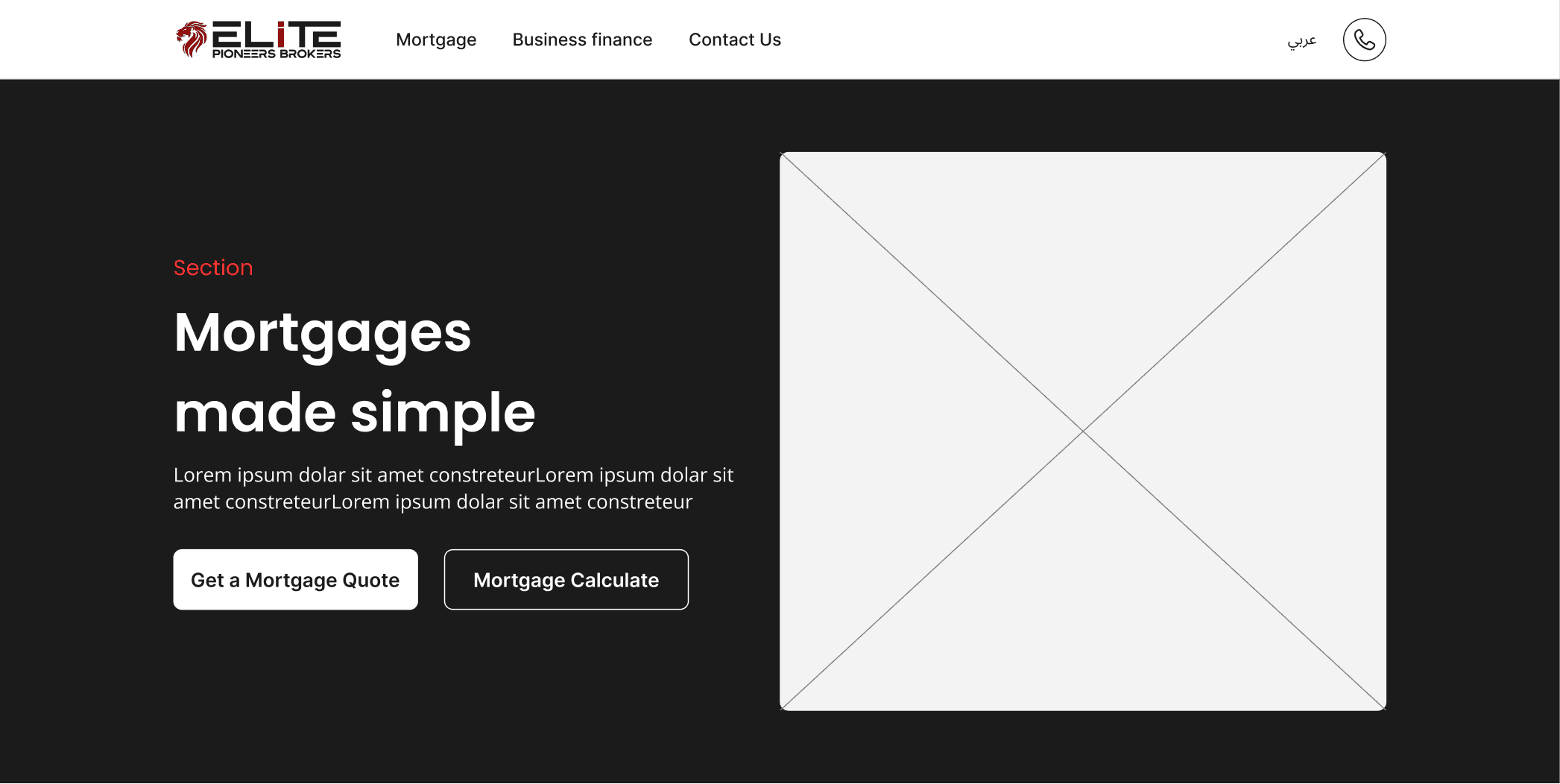
4. Ideate
We explored multiple layout ideas through quick sketches and low-fidelity concepts.
For each section, we proposed two distinct design directions, then discussed and iterated on them directly with stakeholders.
This not only aligned the vision early but also saved development time by validating ideas before going too far.
Option A
Option A
Option B
Option B
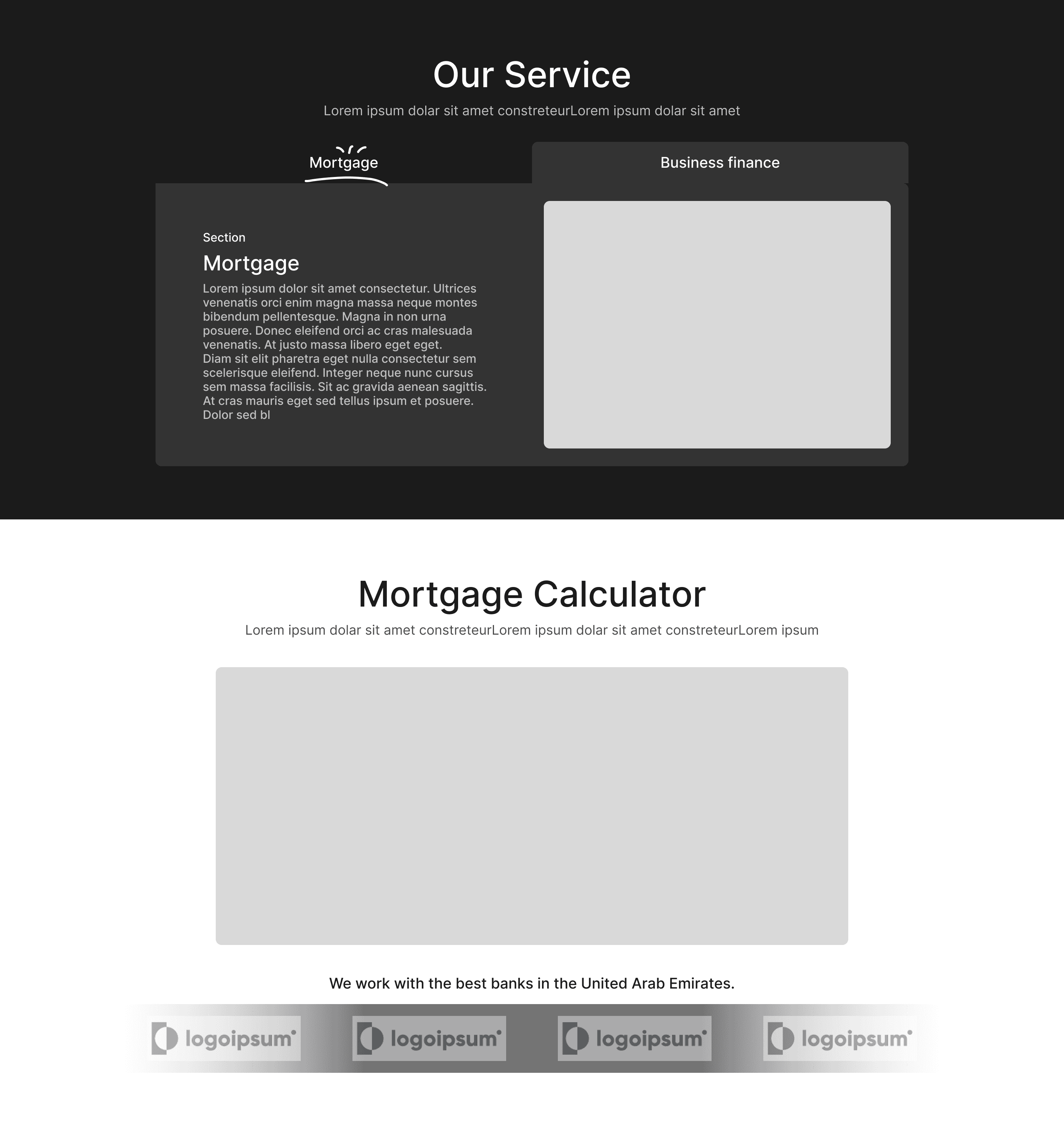
Option A
Option B
Option A
Option B
5. A/B Testing with Stakeholders
After designing two variants for each section, we conducted focused A/B testing sessions with key stakeholders. These sessions weren’t just about visual preference — they helped us validate assumptions, align on strategic priorities, and ensure the final direction truly met both user needs and business objectives.
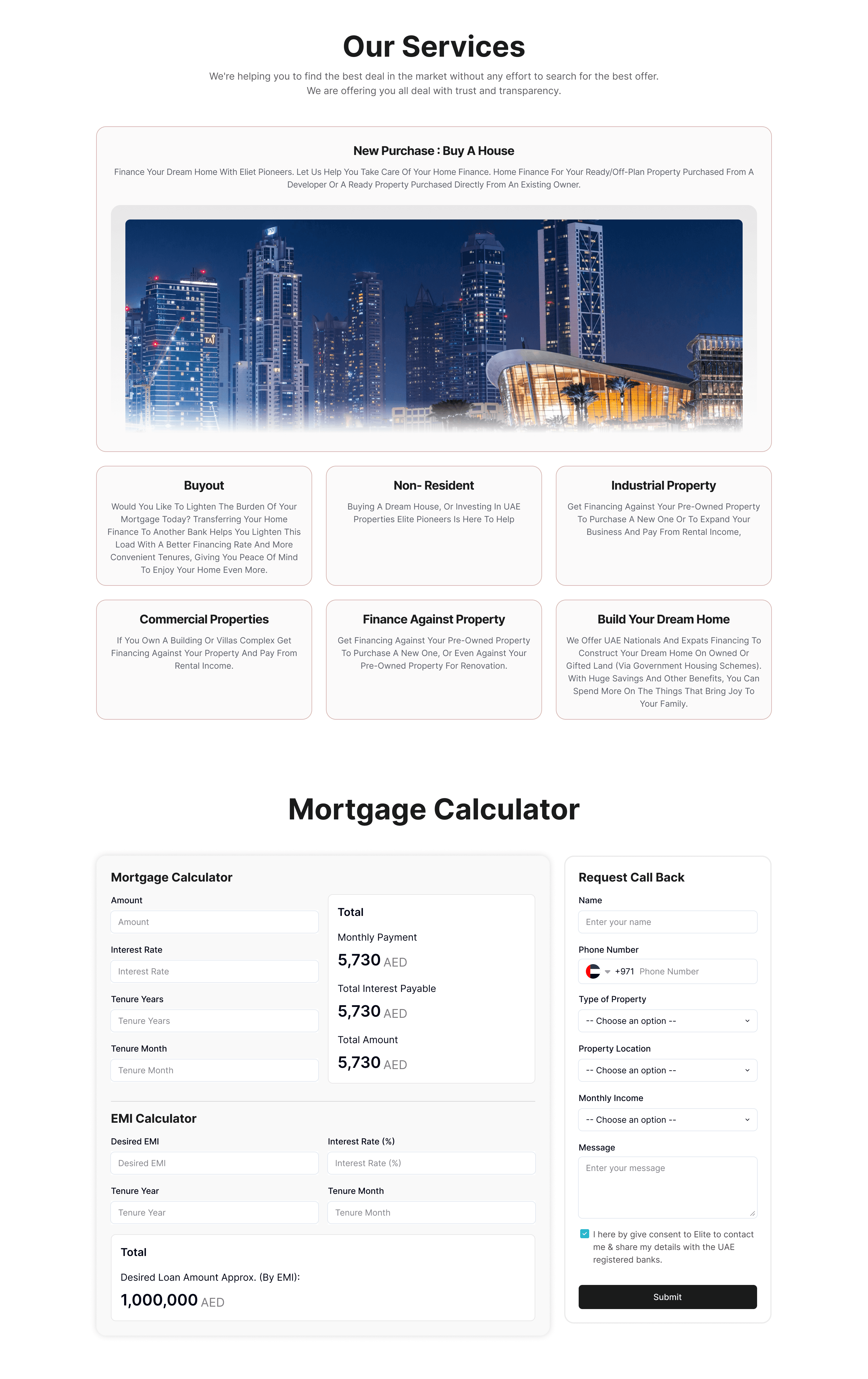
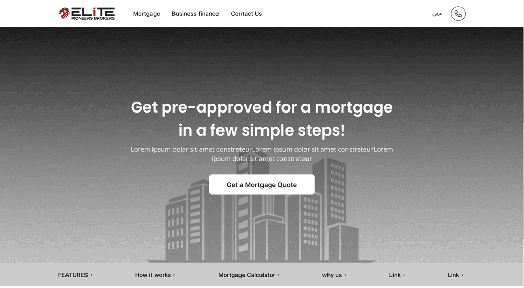
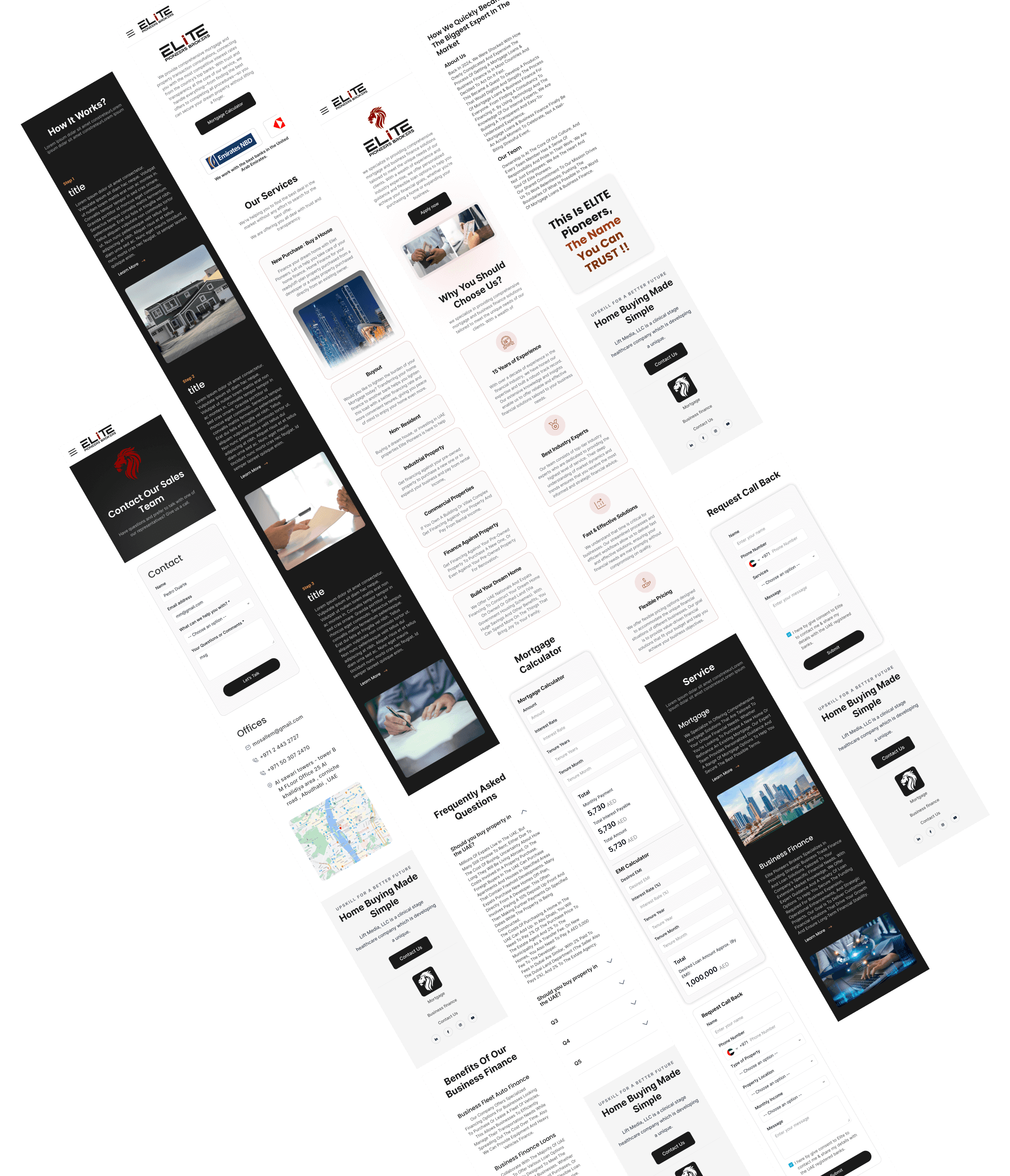
6. Final UI Design (Responsive) & Logo Design
In this final stage, we brought everything together into a high-fidelity responsive UI.
We focused on aligning the visual direction with the brand’s identity while maintaining clarity and usability across all devices.
We also crafted the logo and color system to ensure a cohesive and modern look.
Below are some of the final responsive screens and branding elements we delivered.
7. Developer Handoff & CMS Setup
To give the client full control, we built a simple CMS dashboard where they can update images and content easily — without needing a designer or developer.
For developers, I delivered organized design files, clear components, and responsive specs — making implementation smoother and faster.
Result / Conclusion
We completed the full project — from research to responsive launch — within one month, including several promotional campaigns that followed.
The final result is a fast, modern, mobile-friendly platform that:
✅ Clearly communicates services
✅ Helps users get value upfront
✅ Sets the brand apart from cookie-cutter competitors
✅ Is easy for both users and admins to manage