
SpaceJat – Case Study (REvamp)
If you're designing a collaboration tool—or even thinking about it—and you're about to skip this case study, you're seriously missing out on how we tackled privacy-first design, rebuilt complex flows from scratch, and challenged giants like Zoom and Slack.
Role
Product Designer
Duration
4 weeks
Year
2024
Summary
In this case study, I walk you through the redesign journey of Spacejat, a privacy-focused collaboration platform targeting startups, small teams, educators, and government services.
We reimagined the product experience across web and mobile, solving key usability challenges and building powerful new features—such as streaming, secure channels, meetings, and even in-meeting voting.
You’ll see how we approached the revamp from both a design and product-thinking perspective—while constantly aligning with user needs, technical limits, and business direction.
What's SpaceJat?
Spacejat is a secure, lightweight alternative to Slack, Zoom, and Microsoft Teams—built for those who want full collaboration power without compromising their data.
It allows users to create Spaces (private hubs), where they can host meetings, chat via channels, stream live, and engage with their team—without ever collecting personal information.
Our redesign focused on making all these features more accessible, fluid, and scalable—especially for users like teachers, startups, and military departments.

Meetings

Channels

Spaces

Calls

Messages
Process & My Role
As the sole product designer on the project, I was responsible for the entire UX process—from identifying key problems to delivering final UI designs and design specs for handoff. I collaborated closely with the product manager and frontend team, aligning on user needs and business goals.
To ensure the solution was user-centered, I followed a lean UX approach that allowed for quick validation and iteration:
1.
1.
Gather insights from internal stakeholderss
Gather insights from internal stakeholderss
2.
2.
Identify user pain points and categorize them.
Identify user pain points and categorize them.
3.
3.
Analyze competitors to benchmark UX flows.
Analyze competitors to benchmark UX flows.
4.
4.
Propose experience improvements through flows, wireframes, and final UI.
Propose experience improvements through flows, wireframes, and final UI.
5.
5.
Deliver designs and support implementation with devs.
Deliver designs and support implementation with devs.
Challenges
While redesigning Spacejat, we ran into a few key challenges as a team:
Lack of clear vision from stakeholders
The direction kept shifting — the target users and product goals weren’t clearly defined, which led to repeated changes and confusion.
Technical limitations of the old system
The original structure was poorly built, so adding new features often required complex workarounds just to make things function.Limited resources and tight deadlines
We had a small team and limited time, so we had to prioritize what truly matters for the user experience.
Problems
These problems were confirmed through usability testing with real users.
Several participants reported confusion, frustration, and a general lack of control while navigating the product.
Before the redesign, Spacejat suffered from multiple usability and design issues that affected user experience across both web and mobile platforms. These included:
😕
Users feel lost when starting – there’s no clear guidance
The onboarding experience lacked direction or visual hierarchy
"I wasn’t sure if I should create a space or join one. I just stared at the screen."
😵
Navigation feels scattered and inconsistent
Core sections like chats, channels, and meetings were not separated or prioritized
"Why do I have to dig so deep just to get to a meeting?"
😩
Meetings are disconnected from how users plan their time
Meetings were isolated with no integration into a calendar view or notification system
"I missed a meeting because I didn’t know where to find the invite again."
😖
Mobile experience feels cluttered and overwhelming
Poor visual hierarchy and inconsistent patterns led to user confusion
"On my phone, I don’t even know where to click – everything looks the same."
🤔
No clear target persona caused product direction to drift
The product tried to serve multiple use cases without tailoring the experience to key user segments.
"Sometimes it feels like this tool is built for everyone and no one at the same time."
🫤
Lack of onboarding leaves users lost from the start
First-time users don’t get any guidance or onboarding, making it hard to understand how to get started or what the app is for.
"I opened the app and had no idea what to do next."
Research
Interviews
To understand how users interact with SpaceJat and what pain points they experience, we conducted 1:1 interviews with both new and experienced users from different backgrounds — including educators, business owners, and startup teams.
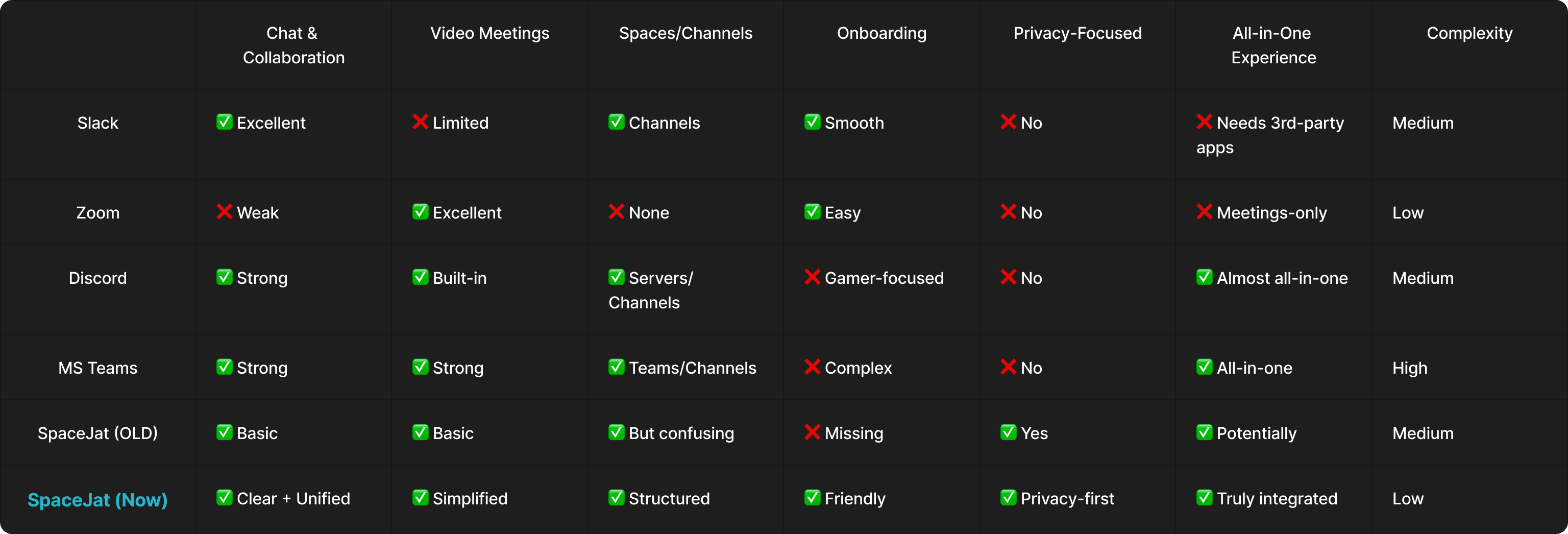
Competitive Analysis
We analyzed major tools that share similar functions with SpaceJat — including Slack, Zoom, Discord, and Microsoft Teams
What We Changed in the Redesign
To solve the core usability problems in Spacejat, we focused on creating a smoother experience with a clearer structure. Here's what we did:
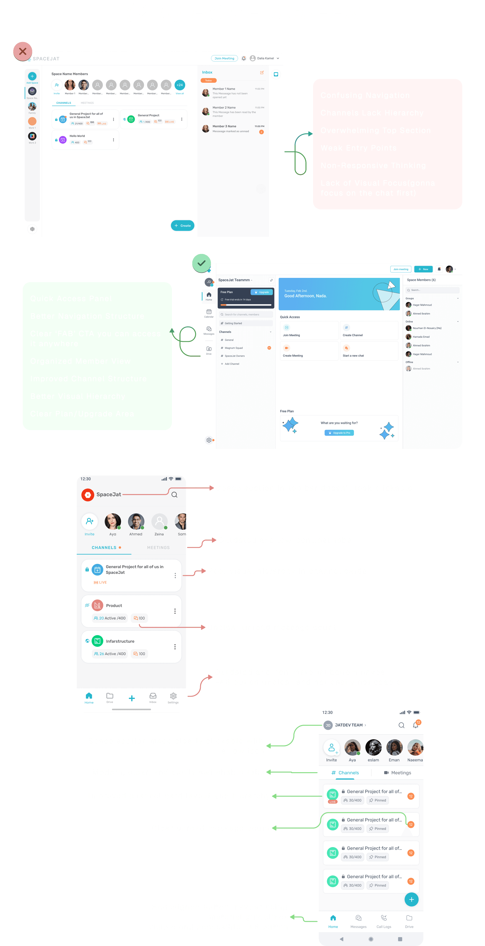
Redesigned the user flow
We reorganized the experience from the ground up — making sure every step is intuitive and that users never feel lost.Improved navigation
We changed the layout to make all core actions visible upfront — like creating or joining a space — especially for new users.Defined user personas
We identified different types of users and designed with their needs in mind, so everyone can find what they’re looking for faster.Rebuilt the structure of channels, chats, and meetings
We gave channels a clearer hierarchy and improved how users interact with chats and meetings. Meetings can now even be added to the calendar.Enhanced mobile usability
We fixed major discoverability issues on mobile — now users can find and access all the important features more easily.
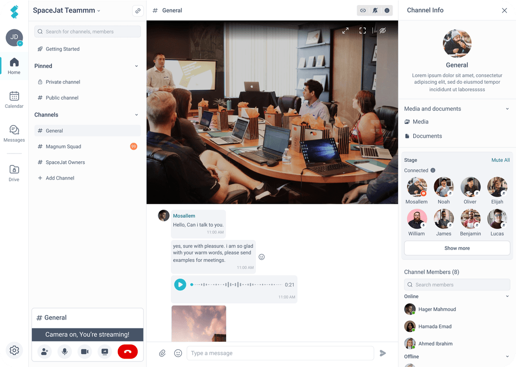
Old vs. New UI
After identifying the core problems in SpaceJat’s user experience, we began exploring multiple redesign directions. Our process included:
Ideating around the pain points gathered from user interviews and usability observations
Designing multiple UI variants to explore different structural and visual solutions
Running A/B tests with actual users and key stakeholders to understand which directions resonated best in terms of usability and clarity
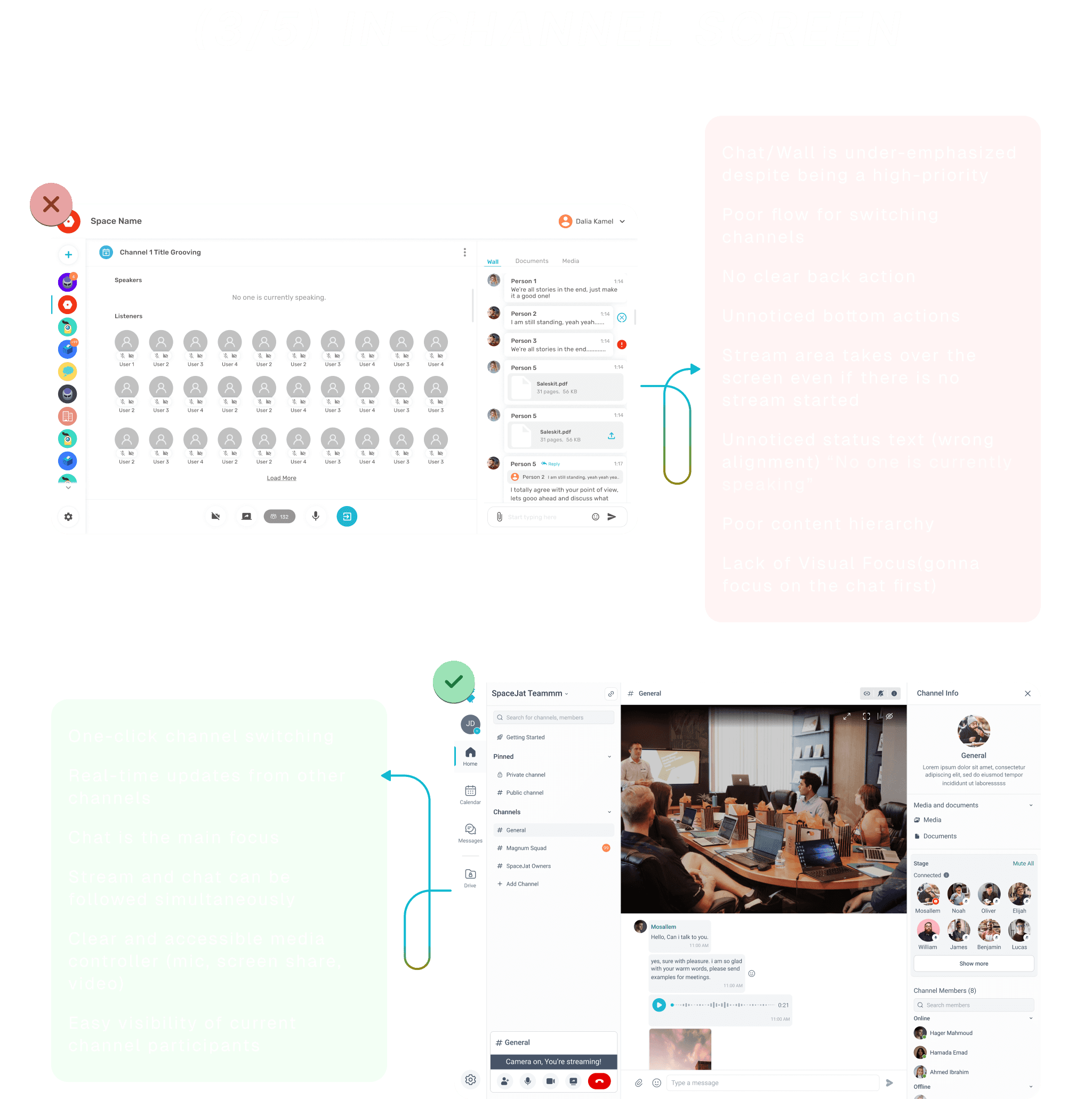
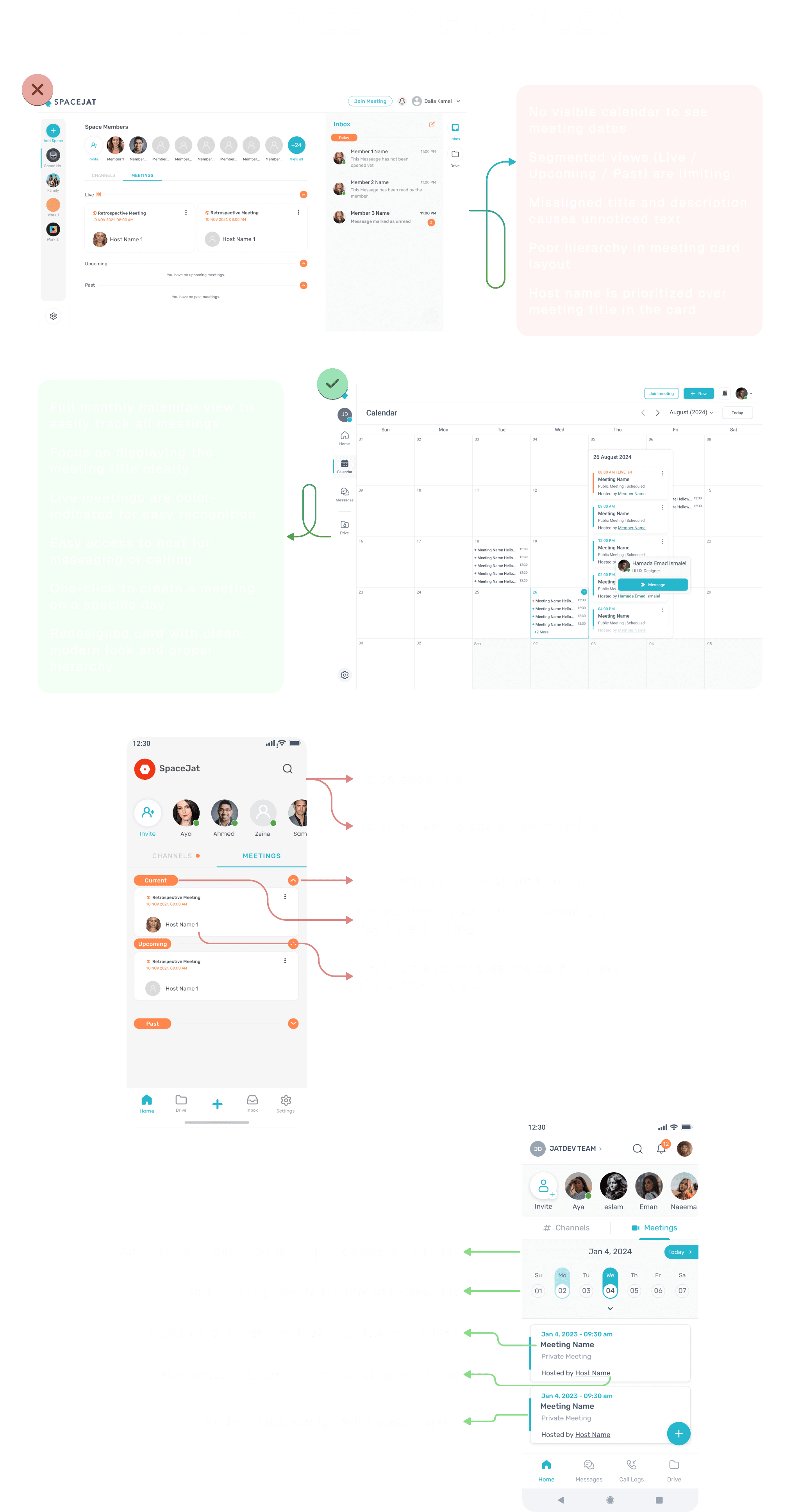
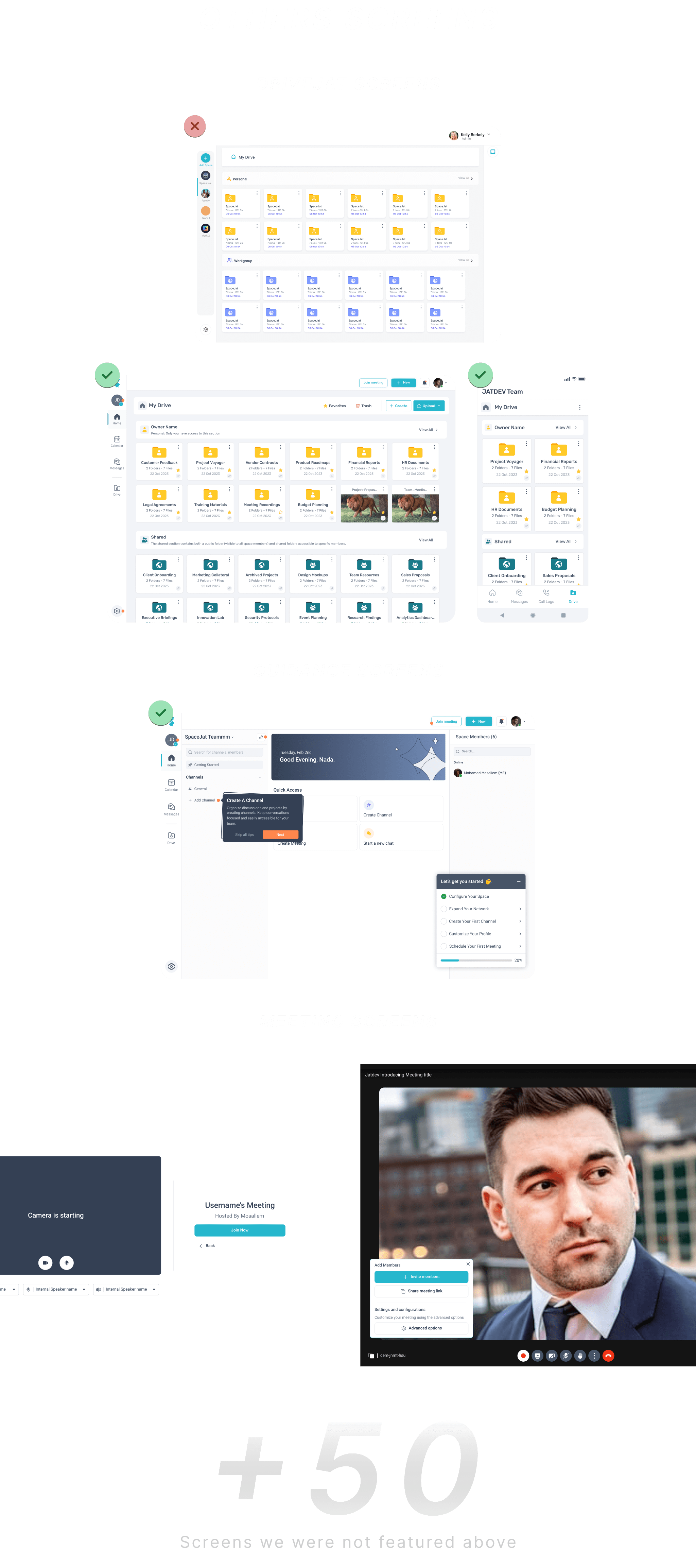
Final outcomes:
Created a clear and modern meeting interface across both web and mobile
Users reported a smoother experience and found it easier to navigate meetings
Fixed major usability issues that were blocking users from basic actions
Introduced a calendar view to improve visibility and planning
Focused on hierarchy to highlight what matters: the meeting title, not just the host
Enabled direct access to hosts for smoother communication
Improved discoverability of live and upcoming meetings
Reduced user confusion by aligning UI elements properly
Enhanced the overall look and feel to match modern UX standards
Conclusion
We identified key usability issues in the old meeting experience, such as poor calendar visibility, unclear hierarchy, and confusing navigation.
The new design solves these with a full calendar view, clear meeting names, better card structure, and easier interaction.
The result is a more intuitive, modern, and user-friendly experience that helps users stay organized and connected.